
Previous slide
Next slide
Re-Design Proposal For Town Website
During my research for the “Onslow Engage” project I identified several key barriers related to transparency and accessibility.
- Project Type: Website Re-design Proposal
- Date: December, 2023
- Role: Citizen that found problems with my local government's website and proposed a solution.
The Problem
The existing website is outdated, lacks functionality and is not accessible to users with disabilities. Insights of current issues:
- Lack of current and complete information
- Updated news, meeting notes, emergency notices and community calendars are not available.
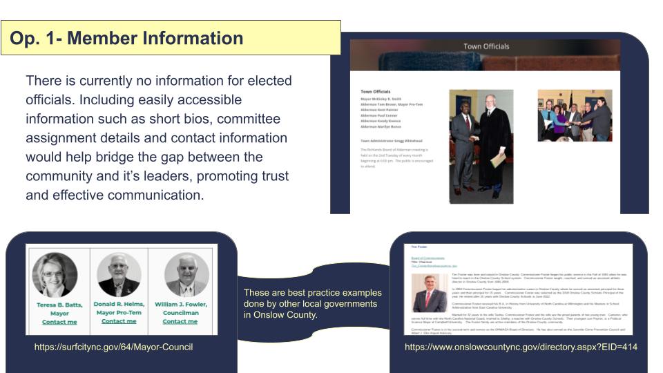
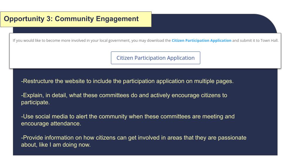
- Information about elected officials and civic participation is incomplete and unclear.
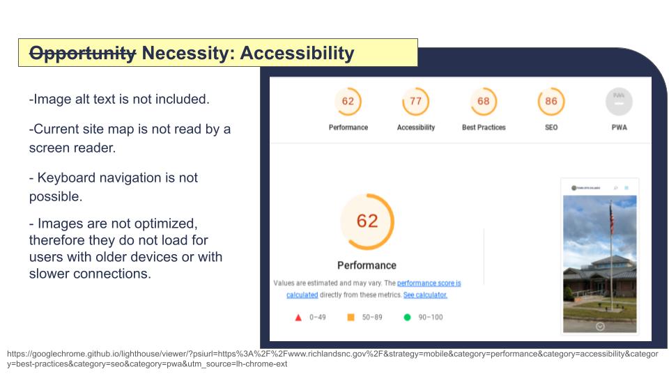
- Site is not accessible and does not meet WCAG standards
- Incompatible with assistive technologies such as screen readers and voice control. It can not be navigated using a keyboard. In its current state, it is completely inaccessible for users who rely on assistive technologies or utilize adaptive strategies to navigate the web.
- Images are not optimized to support varying internet speeds and device capabilities.
Proposed Solutions
- Improve Site Structure (UX/UI):
- Restructure content to prioritize current and most necessary information. I.e, The new homepage in my mock-up features a visible calendar (not a pdf link) prominently towards the top of the page that shows events, meetings and services.
- Larger search bar and a “How Do I?’ button to maximize ease of access to specific information.
- Increase utility by providing connections/links to city service providers and clear information on what is needed to set up services, pay bills and report problems.
- Improve navigation by grouping content in ways more in line with user expectations.
- Accessibility: Compliance with WCAG and section 508 federal standards for universal access.
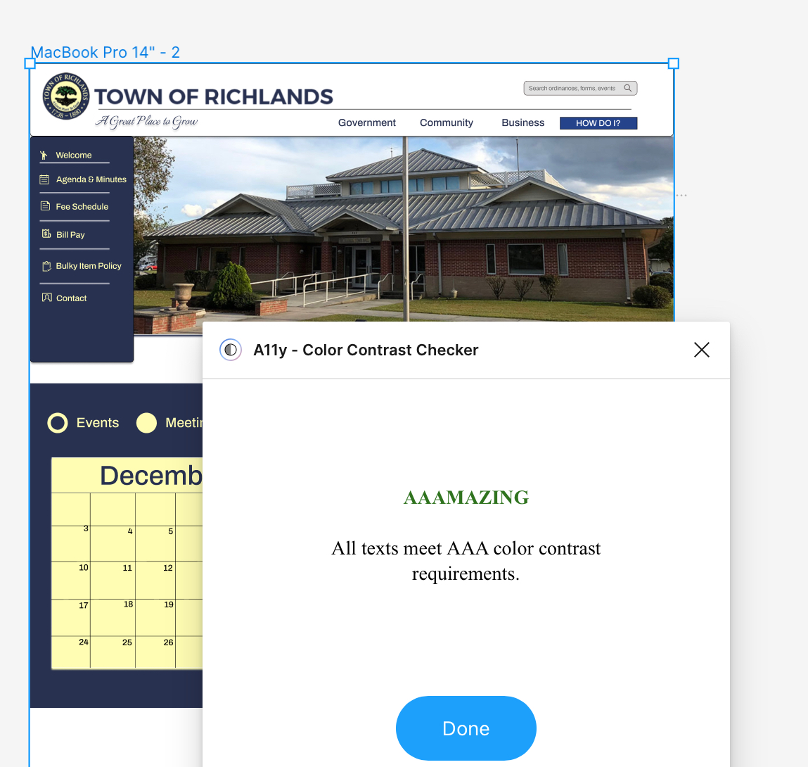
- All color contrasts to meet AAA standards using the logo colors and its variations; 25438B (medium blue), FFFDB3 (light yellow), 283150 (Navy)
- Ensure no elements rely on color indications alone. Multiple cues are given for responses and calls to action.
- Include a “Skip to content” option for screen readers. This allows users to bypass hearing through the navigation menus if they choose.
- Include alt and descriptive text on images and links.
- Prevent cognitive overload by using containers to group information and reduce blocks of verbose text.
- Utilize proper hierarchy labeling that can be navigated with a keyboard or screen reader that include clear focal point indicators.