Accessibility in Design
What Is Accessibility?
Accessibility focused design ensures that users with disabilities have equitable access to digital content, information and services. From the beginning of the design process accessibility considers the different needs of users and how they may access information across all devices using various technologies.
In the US, 1 in 4 people have a disability while 90% of websites are not fully accessible.
Friends, that math ain’t mathin.
What Accessibility looks like
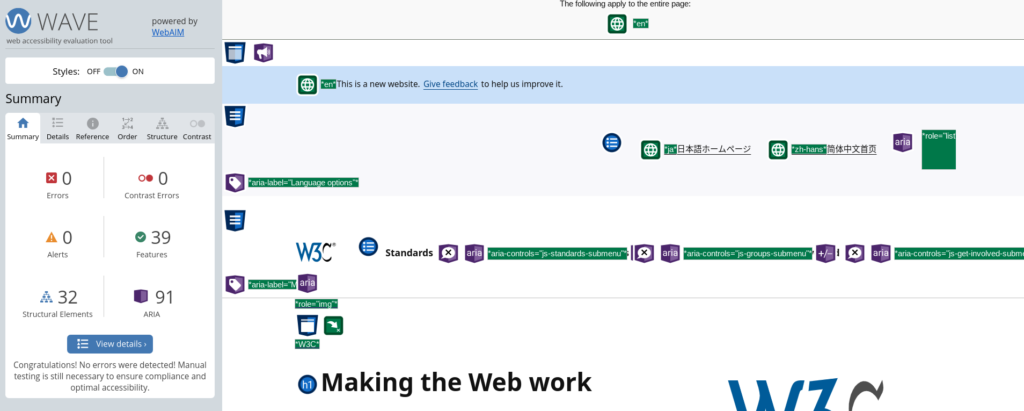
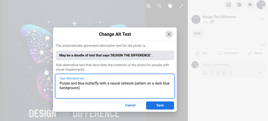
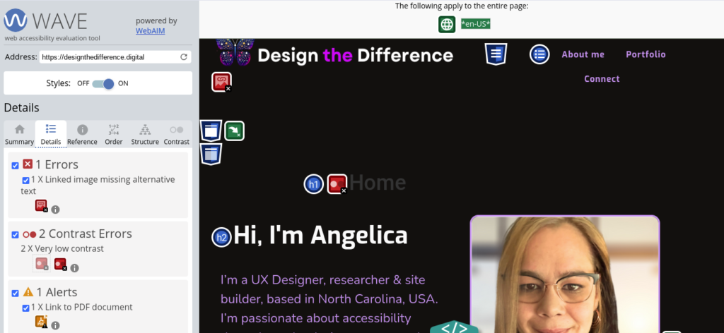
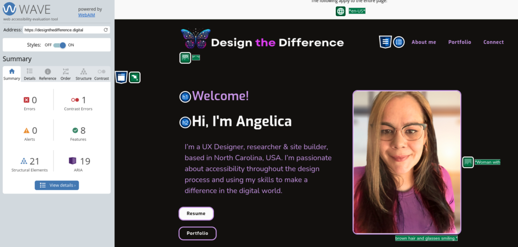
Following WCAG guidelines and using tools to ensure we are meeting diverse user needs from the very start of the process. Including people with disabilities in all parts of creating new products and actively seeking inclusive and diverse feedback. The majority of digital content is not accessible due to easily corrected errors such as low color contrasts, heading structure and poor legibility.
Tools
I’m regularly learning and testing with new accessibility tools & plug-ins. These are some that I have found to be useful and most are completely free! I’m always looking for better ways to do things, so please reach out with any suggestions!
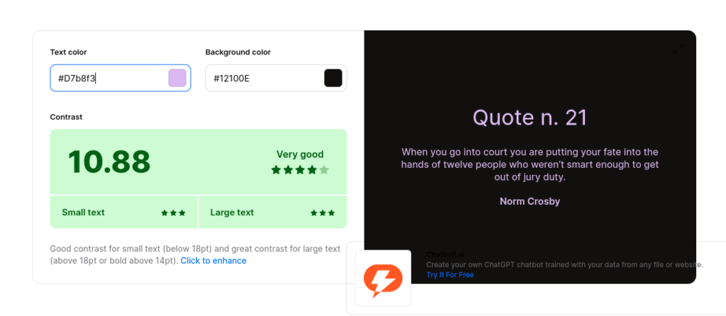
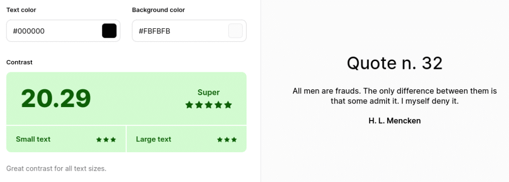
Easiest Color Contrast Checker
Compare contrast using only hex codes and one click! For general projects outside of Figma, Coolors.co is my go to site!
Figma Plug-ins
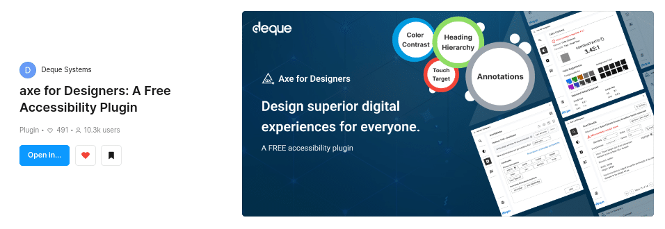
Axe for designers is a must have for me! With this plug-in we can scan for issues from the very first wireframes AND make annotations for the rest of the team.
